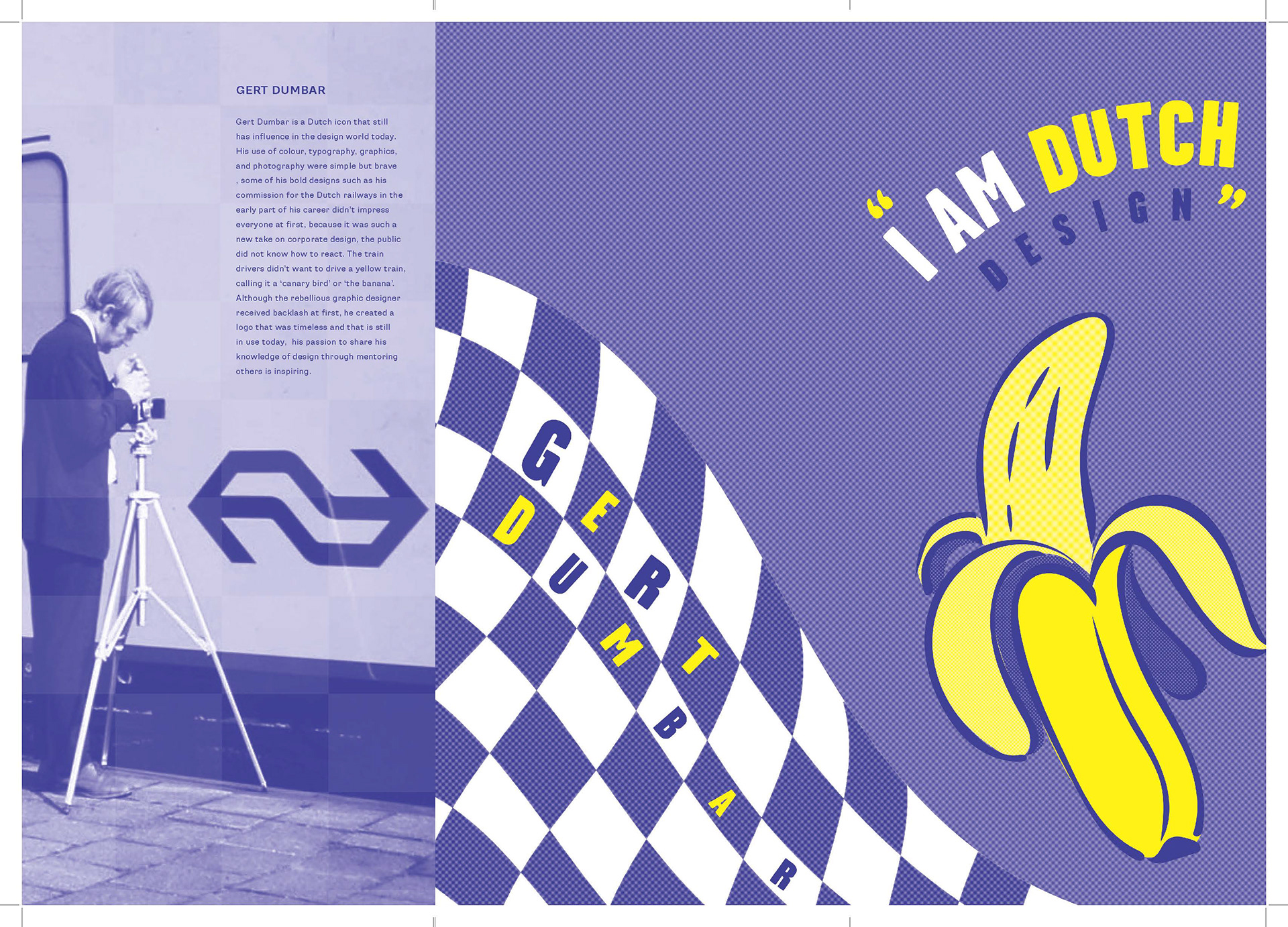
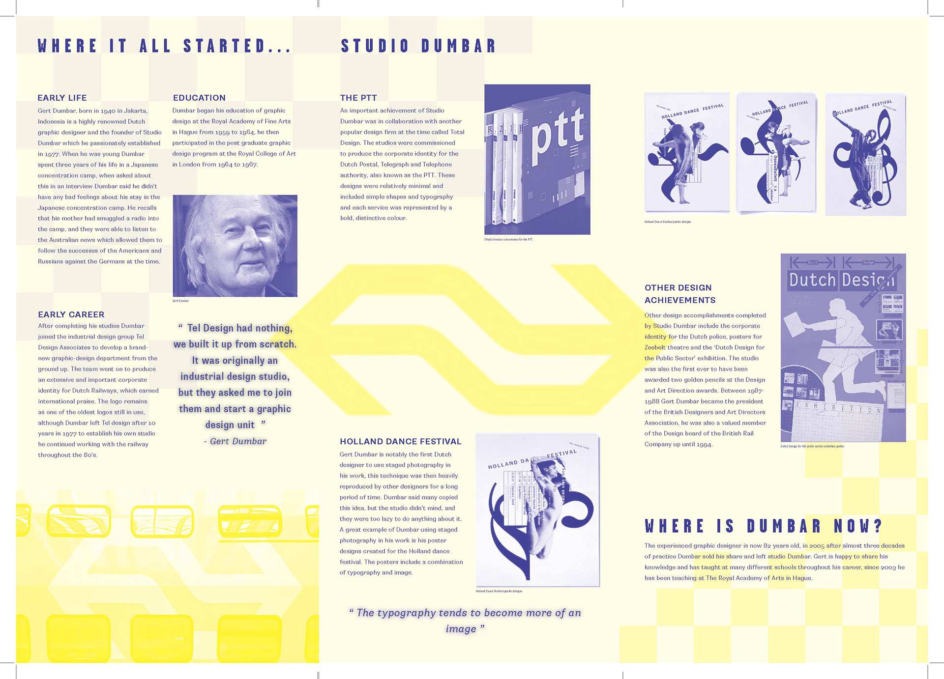
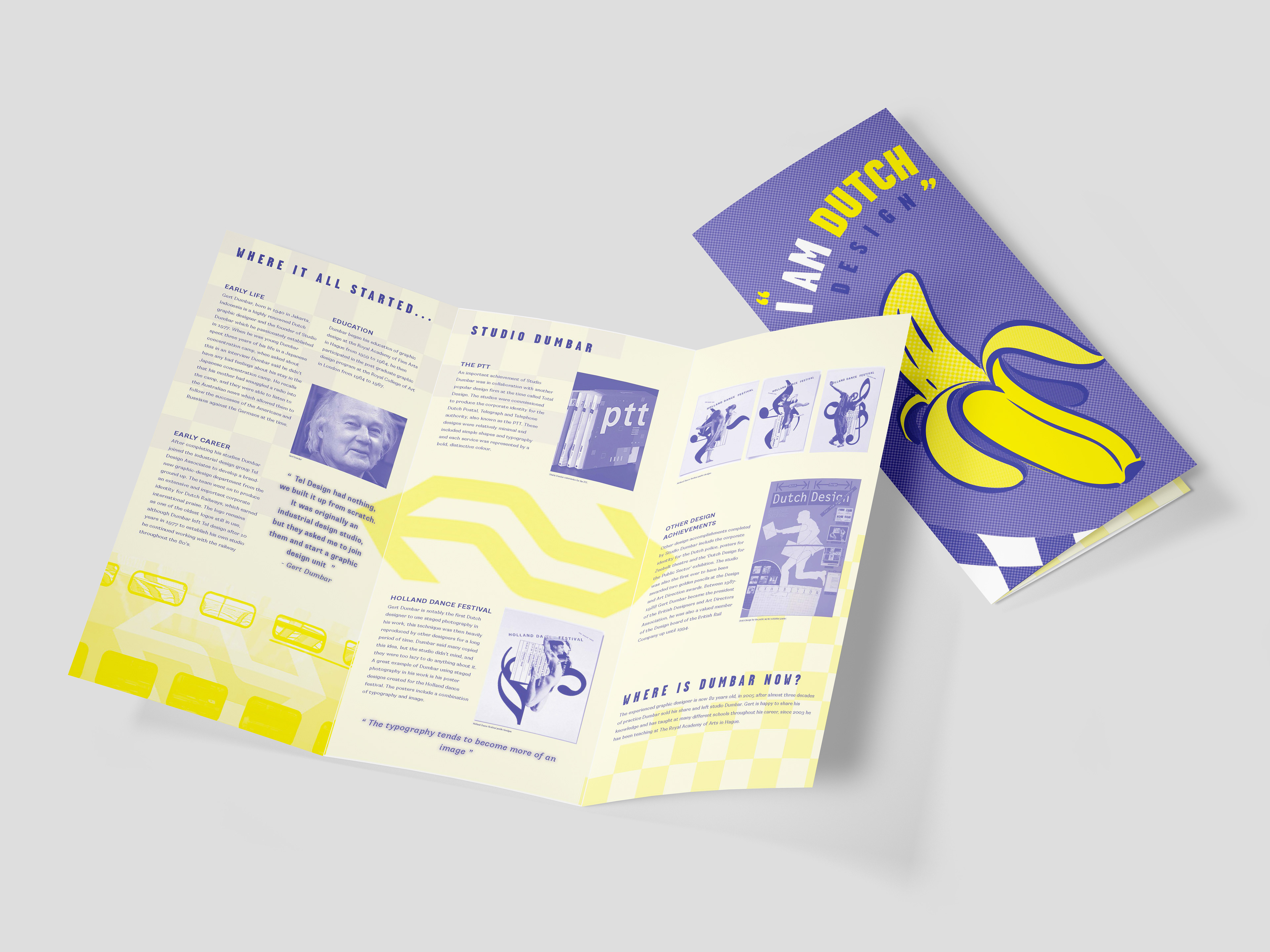

This university publication project explores editorial print and typography through a custom brochure spread celebrating legendary Dutch graphic designer Gert Dumbar and Studio Dumbar. The visual design heavily relies on dynamic typography, bold color blocking in bright yellow and vibrant royal blue, and playful grid structures to capture Dumbar's rebellious, "Dutch Design" aesthetic. Imagery and motifs are carefully chosen to reflect key milestones in his career: the prominent banana graphic directly references the public’s nickname ("the banana" or "canary bird") for Dumbar’s iconic, controversial yellow Dutch Railways train redesign, while the blue-and-white checkerboard pattern pays homage to his famous corporate visual identity for the Dutch Police (Politie). Together, these thematic elements—interwoven with bold typography and historic project showcases—tell the story of Dumbar's revolutionary impact on corporate design, stage photography, and institutional branding in a visually engaging format.